Friday 3 May 2013

Thursday 2 May 2013

Evaluation Q4 - How Did You Use Media Technologies In The Construction, Research, Planning And Evaluation Stages

Throughout the duration of my advanced production, there has been a wide range of new media technologies used to ensure high quality creative control, as well as in depth analysis of existing media text and research which all led to the creation of a complete music video along with promotional material. To create a creative and dynamic music video, new technologies have to be used in full force in order to get the most out of human creativity.

Research
Research in any project is a crucial and fundamental starting point which then structures the project for the longevity of the production, this is where I found using new media technologies hugely effective in relation to the free and instant access to numerous sources found on the internet which proved to inform and inspire me. Throughout the project, I have had to carry out extensive research on a number of different things ranging from Adobe Premiere Pro tutorial and advice to genre specific record sales and the new media technology I have used consistently would be the internet. I found a lot of information on search engines such as Google  Yahoo and Ask.com.


YouTube.com is a video sharing website which enables users to upload and view videos that have been uploaded, the website has become highly popular over the recent years and is a regularly visited page, for mainly music videos and tutorials. This website enabled me to search and listen to a variety of Indie/rock genres, being able to identify common conventions that apply to music videos in that genre. YouTube allows for new bands to create their own channel and use this as a platform to showcase their music videos.Through YouTube I am able to look at the Plain White T's video, looking at their type of music style. 
Below is a link to the Plain White T's official music video to Hey There Delilah.


I also used Flicker and Photobucket for the first time to upload images of the band shots and for my ancillary tasks and other images such as locations shots, that ere taken over the course of the project. I felt that I should used different media platforms to import my images to give a wider variety to my blog posts, this would also show my development in the new media technologies. Drop-box was also another site just like Photobucket and flicker, where I was able to upload images and documents, being able to share them with the public, then keep them in storage like an internet pen drive.


Planning

To keeping in contact when we weren't together, we felt the best way to have a group conversation on either Facebook or twitter, as these to social networking sites are frequently used, we thought this would be a the best way of communicating with each other. 


At the start of this project, knowing that this project would be documented in a blog format, I thought that Microsoft Word would become redundant. This was however not the case, as  realized how heavily we rely on it for planning and scheduling of tasks. Our production schedules and documentation of research, location scouting, casts, costume, style guided were all created using Microsoft Word. 

In the beginning stages of this project we pitch our music video ideas to our media teachers which was then filmed, we used the new media technology such as video equipment and Adobe Premier Pro to document this. By doing so it enabled us to see where we were going wrong and what we needed to do to improve on the planning stage. 


Construction

In the construction stages of my advanced production new media technologies were frequently used, these included standard software's such as: Adobe Photoshop, Adobe Premiere Pro and In-design

Adobe Photoshop was mainly used when I was in the production of my ancillary tasks, I mainly used this to edit my photography I had taken of the band to use in my ancillary tasks. As well as editing my band photographs in Adobe Photoshop I also created my magazine advertisement and my album in Photoshop. Although I had been using Adobe Photoshop since I was in GCSE's there is always new things that I would learn, like how to edit a photograph better to make it look more effective, with most things, the more you use it the better you become at it, this was the case. 

I developed hugely in my ancillary tasks in term of my layout creativity, as I found out more technicalities, I was then able to progress and enhance my work further. However I used In-design to create my digi pack.
Below is a video of me editing a band photo on Adobe Photoshop


http://www.youtube.com/watch?v=giZ8juVPDag&feature=youtu.be


I would create my image based ancillary on Photoshop for both my ancillary tasks but it was Adobe In-design that helped me to finalize and finish up my products so they fit the conventions of a magazine advertisement and album. 

Adobe Premiere Pro was the chosen media software to edit and construct the music video with, which at first was daunting as all of my group and I have little or no experience with this software, however from watching video on YouTube,  trials and practices we were able to develop and enhance our knowledge and confidence in the software which led us to explore more effects that we could use to edit the video with. 

To get the right size for my album when I placed it in the CD case i had to again use In-design to get up the template of the tray card, so I got all the sizing right. However we adjusting my work to the right size I had to constantly adjust all of the images and text to the same size, this become a long process as I had to do it several times before I got the right size, luckily I found that I could merge all the layers together, so when I changed the of my work to all of the images and text would change as well automatically. 

This project has made me more confident with the use of In-design, Adobe Premiere Pro and Adobe Photoshop. I have learnt new techniques by using this software constantly over a long period of time. I have learnt new effective ways of making my band photographs suit the genre of my band. 

Evaluation

To evaluate our products we presented our final media video at our Trinity Creative Arts Evening, we presented our music video to mums, dads teachers  and other relatives , from this we were able to get audience feedback, which we then uploaded to our blog posts (see on the creative arts evening blog post). I also placed my work up on social network site such as Facebook where my target audience would be able to see it. 

Here are a few links to what our audience said after watching our music video :-

http://www.youtube.com/watch?v=60C_61HksPc&safe=active

http://www.youtube.com/watch?v=yCQ1W85ggAE&safe=active


Evaluation Q3 - What Have You Learnt From Your Audience Feedback?

Throughout the duration of this project, i have obtained regular feedback from peers, teachers and my target audience, this has enabled me to progress with the development of this project. Having regular feedback enables me to get the best possible mark, and having the best effective products that suit my genre and appeal to my target audience. 

The first audience feedback we got with this project was when we had finished presenting our very first pitch to the class, explaining our first ideas for this project. From this we gained both positive reviews and positive criticism, however this has given us a better final product. Below is a link to us presenting our pitch.

http://www.youtube.com/watch?v=7wamPRNHrJw&safe=active

As creating a music video was a new experience for me I needed a lot of audience feedback to make sure that everything I was creating was appealing to my target audience. The narrative of the "Hey There Delilah" music video was one specific area that needed development, in which having audience feedback helped me with this substantially. The first video idea basically saw the band performing in an isolated area to show that this was a sad song, with the narrative being two characters walking through the city arguing, making u then arguing again, then making up again. However once we finished the filming and started editing the music video, after the first minute or so we weren't very happy with the outcome. The mise-en-scene was right , the styling of the characters wasn't right, it didn't match the genre of the band,we should our teacher and peers for some advise, whom believe we could produce something more creative and captivating than our original idea. 

The feedback we got from our peers and teachers, gave us the confidence to go for shots that were more daring, bold and creative, pushing challenging concepts that were seen as to be out if our group comfort zone. I feel that the narrative idea that we chose came after much deliberation and development, however now we have a stronger, more creative narrative idea, engaging audiences through the concept of "Reception Theory", we used images in our music video such as abstract wildlife or city landscapes. 


Audience feedback of music video. 

Other audience feedback has proven to be successful, it was suggested at the very end when the guitarist walks off we fade to black as the background is black in the first place it just made the end look more professional and effective, without the fade to black you could see light coming through parts of the background. 

Overall I feel that audience feedback has played a vital key role within the development of my advanced portfolio. I have come to understand without audience feedback our music video wouldn't have reached out to our target audience as well as it does now. With audience feedback whether its positive or negative it helped me progress and develop my work in the right way. I also became aware of usual flaws that I make with a lot of my work, that I wasn't aware of. 

From the positive reviews and criticism we now have an effective music video, that reaches out to our target audience, using common conventions with our own twist to them to making them unique. Below is a link to our final music video. 

http://www.youtube.com/watch?feature=player_embedded&v=Qgg5qSEVRd8&safe=active

Audience feedback also helped me with my ancillary task, below is what my first magazine advertisement looked like. When I look back on my first magazine advertisement draft, I can see that I don't reach out to my target audience well, as I haven't used all the common conventions to appeal to my genre. 

I showed this to my peers and this is the response I got :-

  •  male - the main image doesn't stand out well, the colour of the main image doesn't match the colour scheme of the rest of the magazine advertisement. 
  • male - doesn't show me how i could follow or contact the band by social networking sites.
  • female - I like how the background is a rustic brown that gets darker as it goes further out.
  • male - the font goes well with the genre of the band.
  • female -  Although the main image is in black and white, I can see that the style of the band members fits the band genre well. 
From these criticisms, I was able to develop my ancillary tasks further to make them appeal and attract my target audience. I noticed that I wasn't using all the common conventions that professional magazine advertisements use, which is why my magazine advertisement as reaching out or attracting the attention of my target audience. 

This is now my magazine advertisement, the main image is now more effective, I have added an effect to the image, giving it a darker, rock effect to fit the genre of the band. I have placed falling petals to represent a symbol that the band will always have on their work. 


It is clear to say that without audience feedback our music video and ancillary tasks would be in a critical state, I have been able to acknowledged how vital it is to get feedback from our audience thought the development process. Having other criticize and evaluate you own creations makes you more aware of the common mistakes you are making within your work. Audience evaluations is vital with all work that is being designed and developed over a long period of time as we tend to over look simple mistakes as we see our work constantly therefore we don't notice mistakes which could have a possible big impact the the work being effective or not. 

Evaluation Q2 - How Effective Is The Combination Of Your Main Product And Ancillary Texts?


With my ancillary tasks I wanted to keep a consistency  as well as my main text, making them work together in their own brand identity for the band. As well as keeping consistency within all of my products, we needed to make sure that all of our products as a group maintained a consistency, this is why we all created and agreed on a style guide to work from, therefore if someone place all of our work out they would be able to see that all the product were for the same band. I created a magazine advertisement advertising the release date of the bands new album, however also advertising tour dates, and a digi-pack. The main issues that I had to consider whilst in the production of my ancillary texts was the use of the same logo throughout all the products and the continuation of colours, symbols and image styles.

In my ancillary products, I chose a colour scheme that contrasted well together making texts and images stand out clearly. The background of the ancillary tasks is a warm, bold colour, like the colours in our music video, when the two characters are together in the video the colours are bright, warm colours showing the audience that the two characters are happy together. Although in the ancillary task I feel that the background colour is warm, when the rest of the common conventions have been placed on my products my work has an edgy, rock side to it, incorporating darker colours into the work. I edited the main images I used on my ancillary tasks to fit the genre of Indie/rock, but adjusting the brightness and contrast of the photographs I edited the photographs to make them darker and give them a slightly darker shadow.

Edited version.


You are able to see that the edited version has more of an edgy, dark, Indie/rock to it.

For the photography of the ancillary text, we used a variety of locations, we used Bluewater lake which was a romantic location, we also used London Bridge train station, once edited this was a great location for the lonely, sad part of the music video, which suited the genre of the music video perfectly which then created a strong sense of mise-en-scene for the Indie/rock genre.


In my opinion my two separate ancillary tasks that I created worked well together to create a strong brand image for the band; The Plain White T's. The continuation of styles such as the falling petal and type of editing I placed especially on the photographs proved to make the entire product look more like it belonged to the genre of Indie/rock, it was also an attractive feature for the target audience that we were wanting to attract. 


Here I have placed a poster with petals and without petals, you can see the petals stand out well to the audience and add a real effect to the entire advertisement. As having a symbol to represent the band is a common conventions a genre for Indie/rock.
I also placed the falling roses on the back of my album cover and on every other page inside my albums booklet.


Both individual text incorporate motifs separately yet work well together in unison, the main theme with in the main text is within the narrative of the music video, when the two characters are together and happy the video is in colour, however when the two characters are apart the video is in black and white, whereas the main motif in my ancillary task is the falling rose petals.

The combination of these two motifs across two different media platforms work we, as when the two characters are apart in the music video the video is in black and white and the rose petals fall down on my magazine advertisement  however in the music video when the two characters are together the video is in colour and there is a full blossoming rose that has been placed on the from of the CD, proving a synergistic relationship.

Evaluation Q1 - In What Way Does Your Media Products Use, Develop Or Challenge Forms And Conventions Of Real Media Products ?

The majority of media products today are created in established and repetitive ways, which then transform themselves as recognized forms and conventions to specific areas of media text, for example a TV sitcom will often run for 30 minutes with a circular narrative. Within this blog I will evaluate the way I use, develop and challenge the forms and conventions of real media products.


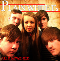
Throughout the products I have created I have consistently used the same font which was called "Poor Richard" and the same colour scheme across all of my products that I have produced throughout this project. When researching real media products in the beginning stage of this project, it was a clear convention that every band have their own band identity, such as a certain symbol or design with in the media texts that the fans would identify easily, and would relate back to this specific band. However this wasn't something that I wanted to do with my products so instead i applied the consistence of a rustic, brown background, and the "Plain White T's" would always be in white, with the "P, W and T" always being in a bigger font size than the rest of the letters. Above and below the "Plain White T's" would constantly be a bold, clear red line, this was to make the words stand out more to the audience. This allows all my products to be easily identified and linked back to the band.  A symbol that would also link all of my products together was the red petals, within each product petals would be falling down the page, this has been placed in my digi-pack and magazine advertisement, the logo although a heart is made out of the same rose petals that fall down the page. 

Looking through the Plain White T's album cover and poster advertisements, the band use the same font for the name of their band in the same colour every time  Although this is a small convention the fans will notice this and link the font and colour back to the band. 


When creating the music video we came across a convention that was very popular split screen and band shots in black and white and the narrative of the story in colour. 

This such a common convention as it helps to move the narrative along and show the audience two side of the video, with the band shots if they are in black ad white in isolated areas then the audience will understand that the band members feel alone, upset sad, whereas if they were in colour the audience would think that the band members are happy and cheerful. Changing a small detail such as having colour or black and white can change the whole meaning of the video. 

The use of consistency has been identified through the album work using the same font and colour throughout every advertisement for the band. The dull colours used in the "Hey There Delilah" music video has also been used on their album this shows then band that the two products are linked. 


In further research for my magazine advertisement i noticed that social networking sites logos are now always place on the products. The presences of social networking sites among the young teenager generation is highly prominent, therefore I felt it was necessary to place the Facebook and Twitter symbols at the bottom of my magazine advertisement as it is a common convention now seen on real media texts, for an my target audience. 


Throughout my work I have followed the conventions of using motifs within my media products which i noticed was prominent in the work of the official Plain White T's work. A motif is a dominant theme which recurs throughout the specific text. I have show already in the images above that the Plain White T's uses the exact same font, in the colour white, the letters are always in capitals. I have used a motif with my ancillary products, using petals which look like they are falling down the page, this is to add a distinguished and creative design for my young teenage audience. I have used the motif in my magazine advertisement to captivate my teenage audience as well as using it in the digi - pack which feature falling petals on every other page of the booklet.

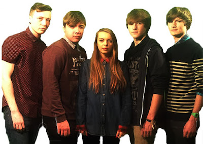
In my ancillary products, I have applied elements of gaze theory through my the photography that I have taken. Through the use of the gaze theory, it enables a wider audience to identify with the product through the visual attractiveness of the band. In the band there are four male members and one female, therefore this will attract both male and female audiences. The five band members together are visually attractive in which people are drawn to. Having both genders in the band opens the audience up wider as the female audience will find the male band member attractive and will aspire to be like the female band member where as the male audience will aspire to be like the male band members and will want to be with the female band member as they find her attractive. 

I have applied this theory subtly, as through the genre of Indie/rock it would subvert conventions by being overly sexual in their appearance. This can bee seen through the outfits the band members are wearing, the male band members wearing either a shirt hanging over their jeans which would be of a dark colour, or wearing a jumper over the shirt with a design on the jumper, the male band members would look casually smart in their Indie/rock genre. Where as the female  band member would have long hair which would be down, wear a shirt with skin tight leggings, subtly showing her physique in a way that is conventional to the Indie/rock genre. Therefore, by subtly using gaze theory it conforms to the conventions of the Indie/rock genre.

Through research traditionally Indie/rock band always feature only one female band member with up to three to five male members, the female band member will traditionally always be the vocalist along with possibly a male vocalist. I believe that through following the conventions of the band line up commonly seen within Indie/rock genre, it made the mise-en-scene of the music video more genre specific.


Band cast 


Music Video

Our video follows the conventions of the genre as the narrative follows the normal forms within the genre. This is because it shows the sadness of a relationship and the emotions through obscure shots. There is also shots of happiness and past times, however within our music video it shows the common codes and conventions that come from other professional music videos, such as holding hands at a lake or going over a bridge. 


This shot is a common convention as the shot shows the two together holding hands, close together, this gives off a happy vibe. 


This shot is from Ben Howard "Only Love " this shows him in a blacked out background, close up of him singing and playing the guitar. We have a shot of our guitarist playing by himself in a blacked out background,however we decided to keep him in colour as we thought it would stand out to the audience clearer. 


This idea came from the band we were researching about the Plain White T's, the song "Hey There Delilah", they were aerial shots of New York at night, so you can see how lively the city is at night, we decided to get an aerial shot of London to see if we could get the same effect.


A shot that is becoming more conventionally common is showing a text from a loved one, either showing the audience what the person said or show that the message has been deleted. Showing the audience that the couple is either making up or breaking up. This is an image from the song "7 things" by Miley Cyrus


Wednesday 1 May 2013

Development - Digi-Pack 1st Draft

Here is my first draft of the front of my album cover, again to improve my work I will ask my target audience for their opinion on what I could improve in my work, I will first show my target audience the front of my album cover. 

1st Draft 


Below is the feedback I got from my target audience :-
  • The background is too dark, needs to be made lighter like the magazine advertisement. 
  • The main image is good you are able to see all of the band members faces, therefore being able to see their facial expressions.
  • To make the title stand out you should underline it like with the magazine advertisement. 
  • You are able to see that red and white are your colour scheme, I feel that this is a good choice as love songs usually use the colours of red and white. 
From the feedback I can see that I only need to make a few small changes to my work. When showing my target audience the front of the album cover I also showed them the magazine advertisement so that they can see that I have used text, colours and symbols to relate the two products together. 

2nd Draft

Below is my second draft, I have made all the changes that my target audience advised me to, below is now what the front of my album cover looks like.

I then again asked my target audience if they had any other advise to help me improve my work, below is what they said :-
  • I like the way the middle of the background is light in the middle it gives an added effect to the entire front cover. 
  • The title stands out so much more now and looks more effective. When the two lines weren't there the top of the cover looked a bit plain and boring. 
  • I don't think there is anything else to add to the album cover as you wouldn't want to over crowd it. 
Now that me and my target audience are happy with the front of my album cover I will now start on the back of the album cover. 

1st Draft

This is the back of my album cover, in my personal opinion I feel that the back of the album cover looks plain however I feel that I already have all the relevant information on the back cover therefore I will ask my target audience for their opinion. 


This is what my target audience said :-


  • You need to place a logo on either the front or the back of the album, every professional album has one.
  • The song names really stand out well to the audience they are at a good font size. 
  • Need to place a bar code. 
  • From looking at your magazine advertisement and the front of your album cover I feel that placing the falling petals would be a good idea, the petal could be a symbol that your fans look for when searching for your band.  


2nd Draft

In my second draft I have now placed all the information and symbols that my target audience advised me on. 


Now looking at the back of my album cover it looks so much better, the petal give a real professional effect. I asked my target audience as a group if they thought I needed anything else on the back cover their response was that they didn't feel anything else was needed as it could possibly over crowd everything, the back cover is at a good balance of images and text.